Organization Systems
The way a website is organized has a big impact on accessibility. With a few simple layout ideas, you can ensure that all users are able to access and enjoy your website comfortably.
Consistency is Key
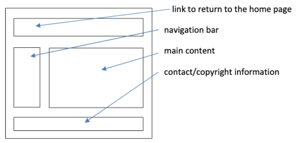
By keeping key structures in your design consistent, users are able to more quickly and easily navigate your site. If you move objects around for the sake of interest, you'll be making the user confused, frustrated, and forced off your page.
For structures such as the navigation bar, don't switch it up. Keep it in one location across all pages, and make sure the navbar options are uniform as well

The page layout should be consistent across the site, as well - if the pages differ too much from one another, users may think they've left your site!
Hamburger Menu
No, we aren't talking about the Big Mac — we are talking about that tried and true classic, the Hamburger Navigation Menu. Navigation bars, while essential for users to effectively use your site, can take up a lot of space on page, particularly on mobile devices such as cell phones where screen real estate is at a premium. Enter the Hamburger Menu:

The hamburger menu is becoming nearly as ubiquitous as the floppy disk icon for “Save” or the wireframe basket for “Trash”. By using these three horizontal bars in lieu of your navigation bar on smaller viewports, the user is cued to click on it, revealing the hidden navbar.
That having been said, some hamburger menus pose an issue for users accessing the web with a screen reader - the screen reader may skip over it entirely or interpret it incorrectly, based on your CSS. One simple fix can be achieved using aria labels in your CSS. Consider adding the following:
<a=”#menu” id=”menu-toggle” class=”menu-toggle” aria-label=”Open the menu”>
	<i class=”fa fa-bars” aria-hidden=”true”></i>
</a>
The aria-label=”Open the menu”> is not visible on the screen and does not execute any action, it is only there for the screen reader to catch and convey to the user. Additionally, the aria-hidden=”true” will hide the icon from the screen reader, as the previous aria label makes it redundant and potentially confusing for the user.
Label, Label, Label
The labels you use around the site - including the navbar - should keep the casual user in mind. If you're using labels that only initiates into your domain will understand, you're turning users away at the door. Instead, go into your label strategy with a plan rather than off-the-cuff ideas.
Labels should clearly indicate the content that follows them - whether on a navbar or in your headers. Additionally, labels are not an opportunity to reinvent the wheel. Users are comfortable with nearly global standards for navbar labels, and if you stray too far from this, you'll leave your users confused and fatigued from navigating a new system.
Additionally, as with the Hamburger Menu above, the simple use of aria labels in your CSS will allow screen readers to more accurately describe your site to users!