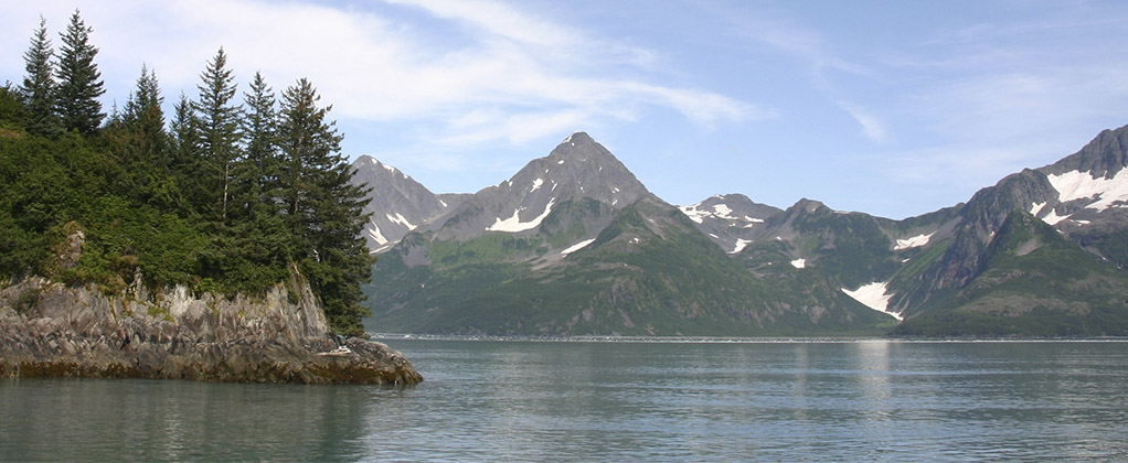
Kenai Fjords National Park is located on the southeastern side of the Kenai Peninsula, roughly 130 miles (210 km) south of Anchorage Kenai Fjords in the United States. The park is home to a variety of animals, including black bears, moose, sea otters, harbor seals and whales. The Harding Icefield, an expansive icefield situated in Alaska, is partially located in the park area. As one might assume, the climate is rigid and cold most times due to its subarctic climate. The park attracts roughly 350,000 visitors each year and offers a variety of activities, such as hiking routes, kayaking, boat tours and winter activities such as travelling by snow mobiles or cross-country skis.
Kenai Fjords National Park is managed by National Park Service, a Government Agency overlooking national parks in the US. For visitors travelling to Kenai Fjords, National Park service website https://www.nps.gov/kefj provides the most information about the park, including activities, weather conditions, alerts and current updates. In this project we are looking into colourblind web design on National Park Service website for Kenai Fjords. See below a short descriptions of issues found on the site:
Navigation:
National Park Service website navigation is solely based on color. Black horizontal navigation bar utilizes dark gray hover color. The tone of both colors is the same, which makes it difficult to distinguish where hover is placed. In drop-down menus, the color used for hover is light green. At the bottom of the page, hover is indicated with a light-grey box on green page number. Using green may be in line with the National Park Service brand, but again may make it difficult for some users to recognize where hover is. In the best case, both navigation bars should also utilize icons or similar to mark where hover is.
Visitor Information:
Under visitor information, colors red and green are used to indicate whether visitor services are open or not. Under Alerts in effect, different hues of colors red are used to indicate several levels of alerts and closures – however, in these cases also icons of exclamation marks and stop signs are shown, to serve site visitors that may not be able to see red colors.
Maps:
Color is used largely in maps, even when displaying crucial safety information for park visitors. Under ‘Alerts’ section, there is emergency closure information, where prohibited area together with trail information is marked in red. For site visitors unable to distinguish red, this color appears close to green, which is difficult to differentiate from surrounding areas. In the best case, red should not be used at all as red and green can be difficult to tell apart.
Sources:
Pickering, Heydon. Inclusive Design Patterns: Coding Accessibility into Web Design. Smashing magazine, 2016.
National Park Service (2022, May). Kenai Fjords National Park. https://www.nps.gov/kefj/index.htm
